Roy Lichtenstein
3 July to 4 November 2013, Gallery 2, level 6
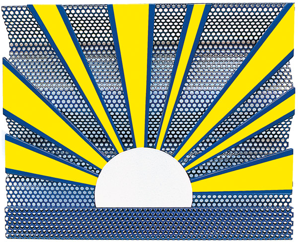
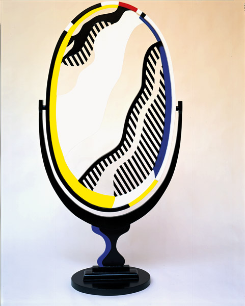
Sunrise, 1965
Enamelled porcelain on perforated steel sheet, 58.4 x 71.8 x 6.7 cm
Edition 1/8
Private collection
- A retrospective
- Beyond Pop art
- Biography
- "What I do is form"
- The works
- - The first Pop works
- "Commercial art is not our art, it's our subject" - - A wealth of technical experiments
- "I want to hide the record of my hand" - - A special relationship with the history of art
- - The first Pop works
- Landmarks − Chronology
- Reference texts
- Bibliography
- More information about the exhibition
- A retrospective
A retrospective
BEYOND pop art
Recognised from the early Sixties as a major contribution to New York Pop art − it formed part of his "hard core", according to specialist Lucy Lippard −, the work of Roy Lichtenstein goes far beyond the chronological, technical and thematic scope of this trend linked with the coming of the consumer society. His strip cartoon-inspired paintings are certainly very famous, but they only represent a brief stage in his career.
Organised by the Centre Pompidou in association with the Art Institute of Chicago and the Tate Modern in London, this retrospective brings together some 120 works, paintings, sculptures and prints, many of which have been loaned specifically for the Paris stage1. And so, alongside well-known Pop paintings from the early Sixties, like Whaam! (from the Tate Modern collection) and Drowning Girl (from the MoMA collection), we find several prints from the Fifties, where Lichtenstein applies the modern artistic vocabulary inherited from European avant-garde artists to subjects in American history, together with a large number of works from the Seventies and Eighties, and some large late paintings that dialogue with great masters in the history of art.
By focusing particularly on the artist's approach in terms of reproducing and appropriating existing images, the exhibition and its curator for the Centre Pompidou, Camille Morineau, show that Lichtenstein was well and truly the first Post-modern artist. The Paris stage of the retrospective also aims to stress his technical inventiveness. So throughout the circuit, little-known works – prints, ceramics, porcelains, painted bronzes and drawings – remind us that he never ceased to experiment and seek out new ways to express his conception of art and the world.
Biography
"what i do is form"
Roy Lichtenstein was born in 1923 in New York, where he spent his childhood and adolescence. Attracted by art and drawing early on, he attended painting classes at the same time as school, then in 1940 began to study industrial drawing at Ohio State University. He was drafted into the US army in 1943 and sent to Europe, where he made use of his leave in London and Paris to visit exhibitions and museums. He stayed in Paris at the end of the war, returning to the States when his father died in 1946. He completed his studies there, then taught drawing at Ohio University and began to produce figurative works – oils, pastels and prints – taking Indians and American history as themes. He began to exhibit regularly in New York in 1951, when critics and collectors rapidly showed an interest in his work.
In around 1957, he painted in an Abstract Expressionist style, while introducing comic strip characters into his paintings. These first attempts were unsatisfactory but led him in 1961 to compose pictures inspired solely by strip cartoons, which he reproduced by imitating the Ben-day dots used in mechanical printing. In 1962, Leo Castelli began exhibiting Lichtenstein in his gallery, at a period in New York when Claes Oldenburg, Jim Dine and James Rosenquist were showing work that was also inspired by mass culture.
Despite the celebrity these paintings brought him, Lichtenstein continued to experiment with all kinds of themes and media, such as ceramics, prints, sculpture, gift-wrap and textiles. From the end of the Sixties, his works began to make increasing reference to great painters in the history of art. His last pieces include a series of paintings inspired by traditional Chinese landscapes and their spirit of Zen. But here again, as he made clear in the Sixties, the subjects were not what held his interest. In an interview, he said: "What I do is form, whereas the comic strip is not formed in the sense I’m using the word; the comics have shapes but there has been no effort to make them intensely unified. The purpose is different: one intends to depict, and I intend to unify." (Interview with Gene R. Swenson, 1963.) This goal of unity imbues his entire work.
Lichtenstein died of pneumonia on 29 September 1997 in New York.
For further details, see the "Landmarks − Chronology" section at the end of the dossier.
The works
THE FIRST pop WORKS
"commercial art IS NOT OUR art, IT'S OUR suBjeCt"
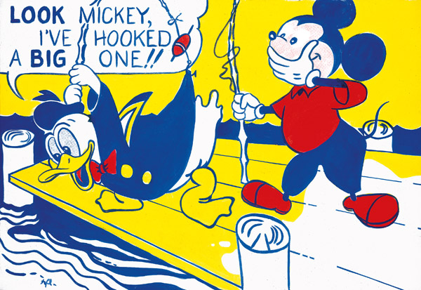
Look Mickey, 1961
Oil on canvas, 121.9 x 175.3 cm
National Gallery of Art, Washington,
Dorothy and Roy Lichtenstein,
Gift of the Artist, in Honor of the Fiftieth
Anniversary of the National Gallery of Art
At the very start of the Sixties, Lichtenstein began composing paintings based solely on cartoons.Look Mickey was one of the first of these works.
The original image is taken from an illustration where Donald Duck proudly announces to Mickey Mouse that he has "hooked a big one", when in fact the hook has caught on his own jacket. The scene as it appears in the album now seems far more old-fashioned than the painting, because Lichtenstein has considerably reworked the image, making its lines more fluid and eliminating several picturesque but outdated details.* The components are reduced to the bare essentials: clean drawing and large blocks of primary colours almost reminiscent of Mondrian. The text, originally beneath the drawing, is shortened and placed in a bubble. The artist's intervention is barely perceptible, since it focuses on the effectiveness of the image. It involves not the addition of elements, but quite the opposite: their removal.
Only revealed to the public in the Eighties, this painting was a decisive stage in the development of the artist's style. His friend Allan Kaprow, who saw him in his studio, encouraged him to pursue his exploration of media culture. For Kaprow, the inventor of the "Happening", Lichtenstein succeeded with this idea in modelling painting on life: an approach that seemed the most relevant to him at the time. Lichtenstein then produced other works of this kind, inspired by cartoons and advertisements. Leo Castelli was not slow to exhibit them in his gallery, staging his first Pop exhibition in 1962.
* See the original illustration on the Lichtenstein Foundation site.
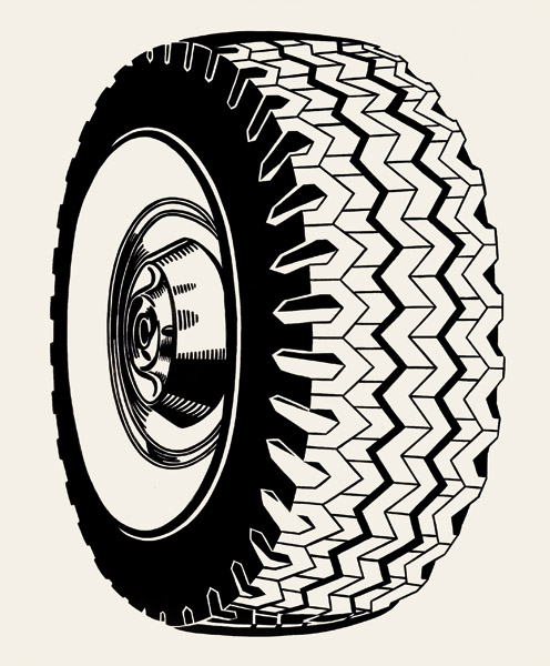
Tire, 1962
Oil on canvas, 172.7 x 142.2 cm
The Doris and Donald Fisher Collection
San Francisco and the Museum of Modern Art, New York
After strip cartoons, Roy Lichtenstein drew on other types of media images, which he reworked and transformed into simple, uncluttered Pop icons. Between 1961 and 1965, he notably produced a series of black and white paintings of manufactured objects against a neutral background, where he simplified the graphic codes of advertising or technical drawing to an extreme. These initially mundane objects took on almost abstract forms, becoming visual archetypal references.
In Tire, the pared-down advertising message shows the grandeur of a symbol of our civilisation, in all the simplicity of black and white and the geometrised motif. For contemporary art historian Alain Cueff, the power of Lichtenstein's painting comes from its ability to imbue permanence into consumer objects condemned to obsolescence (exhibition catalogue: Alain Cueff, "Roy Lichtenstein. Une peinture contre-nature", p.31). Tire bears speaking witness to this power: the object, as redrawn by the artist, is on a par with Celtic jewellery, Greek vases and other precious remains of the past representative of their eras.

Torpedo... LOS!, 1963
Oil and Magna on canvas, 172.7 x 203.2 cm
Simonyi collection
Between 1962 and 1963, Lichtenstein painted numerous strip cartoon-inspired pictures based on stories of love and war. With the war subjects, he used boys' comic strips staging virile heroes ready to take action. His female characters, in contrast, are romantic heroines, who weep big tears or call on their lovers for help and are almost always shown in situations of anxiety. Lichtenstein thus highlights the fact that these American publications, which appeared after the Second World War, unconsciously differentiated the genders and contributed to defining the sexual identity of teenage readers.
In Torpedo... LOS!, the scene chosen by the painter takes place in a submarine, as we see from the periscope in the foreground. The captain, his face contorted in determination, shouts out a terse order to the man behind him. The palette is reduced to a few colours, including bright blue and yellow, not to mention the red of the word "LOS", which leaps out of the page. A few elements thus suggest an electric ambiance in a confined space at the moment a crucial decision is made. Everything in this picture evokes the virility in such an obvious way that it becomes distanced from it. Lichtenstein's subject is not war but the representation of war in strip cartoons.
A WEALTH OF TECHNICAL EXPERIMENTS
"I WANT TO HIDE THE RECORD OF MY HAND"
Sunrise, 1965
Enamelled porcelain on perforated steel sheet, 58.4 x 71.8 x 6.7 cm
Edition 1/8
Private collection
The precise, distanced painting Lichtenstein produced from the early Sixties onwards led him to seek increasingly smooth and glossy media. In 1964, he began to explore enamel, frequently used at the time as a coating for domestic objects, including refrigerators. A thin layer of this translucent material was applied industrially to metal objects, giving them an impeccable finish. Lichtenstein had this done by specialist workshops, while he painted the spots himself with a brush before firing, colour by colour. Apart from the iconography of the consumer society, the artist took inspiration from its processes, adapting them to the demands of his art.
Enamel made a surprising appearance in works like paintings of sunrises or sunsets, where the cold aspect of the material contrasts with these eminently romantic motifs. Thus, while pursuing his idea of removing the slightest potential emotion from his works, Lichtenstein here humorously emphasises the industrialisation of romanticism echoed in the reproduction of sunsets and other picturesque scenes on glossy post cards. The use of enamel also marked his move over to three-dimensional pieces and sculpture.
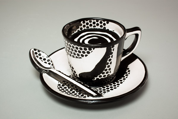
Ceramic Sculpture, 1965
Varnished ceramic, 8.6 x 17.9 x 16.5 cm
Private collection
In 1965, Lichtenstein produced his first ceramics – or more precisely, ceramic sculptures. They include faces of strip cartoon heroines, and cups that could be mistaken for real kitchen items, apart from the fact that they are glued together and cannot be used.
To make these cups, Lichtenstein set up some complex technical methods in collaboration with a specialised ceramist. Produced piece by piece from moulds of ordinary cups, once dry they were glued together according to the artist's instructions: a cup and saucer on their own, or several piled up in an unstable equilibrium. The drawing of dots on the curved surfaces, carried out after an initial glazing, gave rise to some ingenious devices, including the use of perforated masking tape. Firing the colours was also a delicate process, where the ceramists had to deal with unpredictable chemical reactions, while Lichtenstein was looking for a precise result.
His cups were exhibited at the Castelli gallery with a series of Brushstrokes (see below) immediately after they were produced. Lichtenstein subsequently created a genuine crockery service imitating his works, which was offered for sale in a shop at a modest price, humorously cultivating the ambiguity between objets d'art and functional items. But he then stopped working in ceramic, as the process was too uncertain for the rigorous way he worked.
Landscape 6, 1967
From the portfolio Ten Landscapes
Screen print on blue-green moiré Rowlux with chromogenic photographic print collage
mounted on four-ply white 100% rag board, mounted on white composition board, 42.2 x 54.7 cm
Edition 96/100
Bibliothèque nationale de France, Paris
Print and Photography Department
After trying out painting on Plexiglas, screen printing on plastic sheeting and lithography, Lichtenstein discovered Rowlux. The name came from the company Rowland Products, which made the material to cover urban signposts. The moiré surface of this material creates 3-D optical effects, which Lichtenstein thought of using to represent changing skies and turbulent seas. He saw Rowlux as "a kind of ready-made nature".
In Landscape 6, the moiré paper is enhanced by a screen print and a collage. In other works, there are sometimes motors that make part of the picture move, accentuating the material's optical illusion effect, or the light that moves over landscapes. These endeavours brought Lichtenstein close to the Op Art developing in the middle of the Sixties.
Mirror II, 1977
Painted patinated bronze, 151.8 x 76.2 x 30.5 cm
Edition 3/3
Private collection
Like the artists he admired (including Picasso, Matisse and Degas), Lichtenstein explored sculpture – a painter's kind of sculpture, because it was linked with his pictorial explorations. Mirror II, in painted patinated bronze, is like a three-dimensional materialisation of a painting, a kind of artistic "spin-off object" making play with the ambiguity between reality and fiction. But he also more specifically broadened his artistic explorations on the theme of the mirror begun in 1969. Taking inspiration from commercial catalogues, Lichtenstein precisely chose pictures of mirrors that did not reflect anything to create exceptionally spare works using a few Ben-day dots, lines and colour blocks. According to American art historian Graham Bader, this theme set him on a quest for "pictorial terseness" (exhibition catalogue: Graham Bader, "Face aux Mirrors de Roy Lichtenstein", p.108).
However, through these extremely pared-down means, Lichtenstein succeeds in evoking a rich, poetic world, chiefly by making reference to celebrated paintings such as Las Meninas by Vélasquez, or Le Bar des Folies Bergères by Manet, which explore references to the self in art. But with Lichtenstein, the mirror also questions viewers, who can seek their own reflections there. And then, beyond that, we seek – in vain – to see the artist's own face, which makes the Mirrors series highly mysterious self-portraits.
A special relationship with the history of art
Brushstrokes, 1965
Oil and Magna on canvas, 122.5 x 122.5 cm
Private collection
After his initial figurative period, in 1957 Lichtenstein tried painting in an Abstract Expressionist style. But he rapidly brought figures back into his works: an initiative that speaks volumes about his relationship with this movement and its legendary search for spontaneity. During his student years, it was simultaneously the dominant style and a foil.
In 1965, Lichtenstein succeeded in formulating this ambivalence through his Brushstrokes: paintings produced using the mechanical style of Ben-day dots, representing brushstrokes evidently applied in an energetic manner. A paradox expressed by the artist: “In my hands, the brushstroke becomes a depiction of a grand gesture. So the contradiction between what I’m portraying and how I’m portraying it is in sharp contrast.”
From 1980 onwards, he even produced Brushstrokes as sculptures. The modernist brushstroke of Abstract Expressionism, which extolled the specificity of media, is thus humorously displaced into another dimension. It is thus not surprising that these works, light-heartedly questioning the essence of painting, had a major influence on Bertrand Lavier, whose objects painted in "Van Gogh-like strokes" concur totally with the American artist's approach.
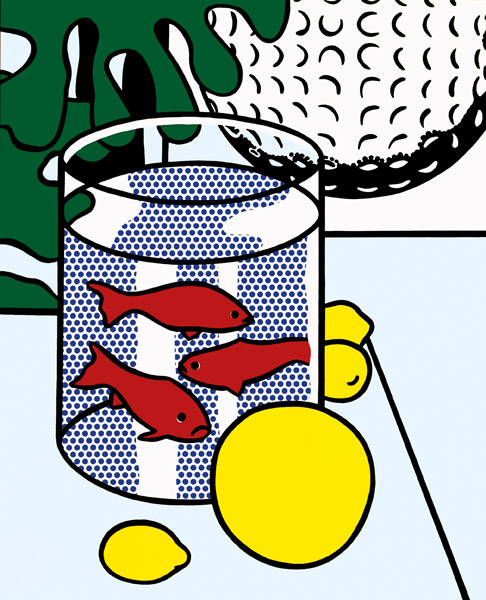
Still Life with Goldfish, 1972
Oil and Magna on canvas, 132.1 x 106.7 cm
Private collection
In 1962, Lichtenstein began to produce "remakes" of masterpieces in the history of art. Without the slightest irony, he cast a contemporary eye at works from the past, just as Picasso did with Vélasquez and Delacroix.
In Still Life with Goldfish, he followed in the footsteps of another great master in his personal pantheon: Henri Matisse. Above all, he quoted his still lifes, and took inspiration from the way in which the painter from Cateau-Cambrésis included his own works in his pictures. In Still Life with Goldfish, we see not only the goldfish bowl often painted by Matisse but also, in the background, one of Lichtenstein's own 1962 oils on canvas of a golf ball (the work can be seen in the first room of this exhibition). Thus, like Matisse, Lichtenstein reflects on the reproduction of his own works as paintings within a painting, and their proliferation as a motif mingled with those of other artists. In doing this, he establishes his own place in an artistic line, while also opening the way to Appropriationists like Sherrie Levine, who turned copying into a conceptual approach several years later.

Landscape with Philosopher, 1996
Oil and Magna on canvas
264.2 x 121.3 cm
Private collection
While Lichtenstein had quoted masterpieces since his Pop years, in 1995-96 he turned for the first time to another pictorial tradition when he produced a series of very large paintings inspired by mediaeval Chinese landscapes reproduced in a book, The Essence of Chinese Painting. But here again, the composition simplified the original image to emphasise its characteristics: the elongated format of the roll, the vigorous graphics and the proportion of emptiness evoking the spirit of Zen. He interpreted them though a large vertical format, where the dark silhouette of a tree in the foreground contrasts with the pastel shades of the rest of the picture, and the highly minimalist evocation of mountains and sky.
However, the effect of distance usually produced by the Ben-day dots is not as pronounced in this series as previously. It is tempting to think that, in the final period of his artistic achievements, the artist identified himself a little with Far Eastern painters who, throughout their lives, strove to attain a simplicity and sobriety they equated with wisdom.
LANDMARKS − ChronologY
| 1923 |
Roy Lichtenstein is born in Manhattan. Early on, he develops an interest in drawing and painting. |
| 1940 | After taking art lessons at the Art Students League, he starts studying industrial drawing at Ohio State University. |
| 1943 | He is drafted as an officer into the US army. When he is sent to Europe, he uses his leave time to visit museums and exhibitions. |
| 1946 | On his return to the US, he starts to teach drawing, while painting oils and pastels at the same time. |
| 1949 | First group exhibition in New York. |
| 1951 | First solo exhibition at the John Heller Gallery in New York, where he exhibits regularly for the next few years until 1960. |
| 1957 | First appearance of comic strip characters in his works. |
| 1960 | Through Allan Kaprow, he meets Claes Oldenburg, George Segal and other artists. |
| 1961 | First works entirely composed of images taken from comic strips. He starts to depict figures using the Ben-day points typical of mechanical printing, which he paints by hand using perforated grids. First group exhibition at Leo Castelli's gallery, which now represents him. |
| 1962 | First solo exhibition at Leo Castelli.
Crying Girl, 1963 |
| 1963 | First solo exhibition in Europe at the Ileana Sonnabend gallery. He takes part in "The Popular Image", an exhibition at the Institute of Contemporary Arts in London. |
| 1964 | He begins to reinterpret the classic genres of landscape and the portrait in a cartoon style. He tries out other media and techniques: Rowlux (for screen prints), enamel and porcelain. These works are presented at his second solo exhibition at Leo Castelli. At the end of the year, another solo exhibition is staged at the Ferus Gallery in Los Angeles. |
| 1965 | First paintings in the Brushstrokes series, which are exhibited the same year at Castelli with his ceramic pieces.
Modular Painting with Four Panels, #4, 1969 |
| 1966 | He exhibits with Ellsworth Kelly, Helen Frankenthaler and Jules Olitski at the American pavilion in the Venice Biennial. |
| 1967 | First retrospective of his work at the Pasadena Art Museum, then the Walker Art Centre in Minneapolis. First European retrospective at the Stedelijk Museum in Amsterdam. |
| 1969 | First collaboration with the Californian publisher Gemini G.E.L. on his prints. |
| 1970 | He moves to Southampton in New York State. |
| 1971 | The Mirrors are shown for the first time, at Castelli. |
| 1974 | The four large paintings in the Artist's Studios series are exhibited at Castelli. |
| 1975 | Solo exhibition of drawings at the Centre National d'Art Contemporain in Paris. |
| 1976 | First flat sculptures in painted bronze. These are exhibited the following year at Castelli. |
| 1982 | He sets up another studio in New York and gradually moves back to this city. |
| 1987 | Retrospective of his drawings at the MoMA. |
| 1990 | Beginning of the series Interiors: large paintings of interiors with contemporary furnishings. Several works are shown in the exhibition "High and Low. Modern Art and Popular Culture" at the MoMA. |
| 1992 | Some of his pre-Sixties works are shown in the exhibition "Hand-Painted Pop, American Art in Transition 1955-1962", at the MOCA in Los Angeles. |
| 1993 | He begins to paint female nudes. Retrospective of paintings and sculptures at the Guggenheim, New York. |
| 1995 | Start of the series Landscapes in Chinese Style. |
| 1997 | Lichtenstein dies in New York. |


REFERENCE TextS
Richard Hamilton : « Roy Lichtenstein »
Studio International no. 896, January 1968 (extracts)
Roy Lichtenstein, Oldenburg, Warhol, Rosenquist and Jim Dine have gained their exalted position in the international art scene very rapidly. It wasn’t so long ago that a curator of painting at the New York Museum of Modern Art was publicly complaining that whatever it was that they were doing it wasn’t making art. The basis of Peter Selz’s contention was that an artist must transform his source material in some very tangible way and this necessary transformation was not so evident in the work of the so-called “Pop Artist”. I doubt if any museum official anywhere would now be so rash as to suggest that “Pop Art” is not art or that an aesthetic transformation has not occurred. Most artists disliked the label “Pop” when it is applied to them but Lichtenstein accepts it fairly happily. Of the Pop Artists, I suspect Lichtenstein is the only one who would have some interest in this question of transformation, in particular of just how little of a transformation will make sense, because he has been more concerned than the others with consideration of this issue as a factor in his work.
[…]
His major concern appears to be with the task of depicting a figurative subject in such a way as to adhere to the two dimensional integrity of the canvas and in these preoccupations, he poses as an abstract artist like Mondrian or Vantongerloo (a disguise from which he later emerges). The clinical picture planning, in which he parallels these artists, repudiates physical virtuosity in aggressive conflict with his immediate New York stock.
|…]
Curiously enough, if Warhol’s aim is frankly seditious, to pervert and destroy older aesthetic viewpoints, another aura is given by Lichtenstein. This is partly the consequence of his technical detachment but not less it is due to the emotional remoteness of his pictures. Under the flippant surface, Warhol seethes like Goya, Lichtenstein is more like Ingres. Though the comic-strip heroines drip tears in great blobs, he doesn’t move us to pity. There are many sad and sadistic images (a boot smears flesh on hand that grasped a gun) which merely cause us to smile – they are like the old horror comic joke of a man hanging by his fingers from the top of a cliff while his tormentor stands over him saying, “If you want to die with your hands on, drop”. His aerial battles and explosions are no more a condemnation of war than a glorification of it. They excite a purely aesthetic response.
[…]
What Lichtenstein makes perfectly clear is that all his subjects are made as one before he touches them. Parthenon, Picasso or Polynesian maiden are reduced to the same kind of cliché by the syntax of print: reproducing a Lichtenstein is like throwing a fish back into water.
“I guess in the beginning I was interested in printmaking because you could get a more Pop precision than you could get in painting.”
Interview by the Independent Study Program of Whitney Museum, 1981 (extracts).
Reproduced in French in Roy Lichtenstein, Ce que je crée, c’est de la forme. Entretiens, 1963-1997, Paris, Centre Pompidou, 2013.
Independent Study Program. Why is printmaking of interest to you ?
Roy Lichtenstein. You go about it in a different way than you do painting. I think you have to be clearer as to the image. The amount of work involved makes you constantly reevaluate and rethink. The tools are different and it’s a change of pace. I like going out of my studio to make the prints. I’d just as soon paint, but I like treating printmaking as if it were a vacation.
When I was at school, graphics were always a kind of naïve offshoot. Of course Mauricio Lasansky and Stanley William Hayter were doing prints. But I never treated prints as an advanced area. I did do prints in school – lithographs, etchings, and woodcuts. Later, when I return to graphics, I guess it was the idea of Pop. Pop looked like printed images and putting the printed images back into print was intriguing.
I.S.P. Your paintings have a strong graphic quality. What do you see as the essential differences between your paintings and prints?
R.L. The kind of graphic quality the paintings have comes from commercial printing. The more recent prints I’ve done have introduced qualities that I couldn’t get in paint or were reasonably difficult to get in paint. For example, certain qualities in the Entablature prints – of reflective material, color, and texture – aren’t really available in paint. I could make a collage (as with the Entablatures) and through embossing the lines, give the prints more solidity, power, and concreteness.
I guess in the beginning I was interested in printmaking because you could get a more Pop precision than you could get in painting. Many of the earlier prints are, I think, quite mechanical. I wanted them to be as mechanical as possible. The Cathedrals, the Haystacks, the Modern Heads, and the Peace Through Chemistry series had a precision which I wanted to get in the print because I couldn’t get it in the painting. Now, I’ve changed what I want: I like to work toward precision but not be able to achieve it. Working against wood – cutting wood - makes absolute precision impossible. I have a tendency to try to make it neat – “neat” is one word, but “precise” is maybe another – to make the lines as precise as possible. Wood is the thing that I’m really interested in now because with it you can’t achieve this neatness but you can try to get it and then achieve certain qualities in the process. You get the grain, something that has a little more feeling to it. […]
I.S.P. Do you think your prints reproduce well?
R.L. Not especially. I think they may be hard to reproduce photographically for a number of reasons. Mainly, the extremes of color, from say a very lemony yellow to an ultramarine blue to a kind of red, that you can’t get accurately at the same time in a photographic process. When the dots in my work were smaller, there was a real interference between the dots used to produce color in the reproductions and my dots. As my dots became bigger in the later works, they were readable as dots; they didn’t become moiré patterns.
I like drawing the way draftsmen draw or the way somebody starting commercial art school draws. You know they never looked at the object but only learned how to make the symbols for it – how to draw an eye or how to draw drapery. There is a real clumsy look to the drawing. It looks as though draftsman’s tools were used to do it, which removes it from reality. So it becomes a scheme, a diagram of something. What interested me is how unrealistic things taken for realism are, and how far from photographic reality graphics can become, yet people still read them as a literal depiction of the subject matter. This is particularly true when it’s done in commercial art which is always thought of as realistic in people’s minds. A picture of a stack of towels or sheets on a table, done as a draftsman would draw them, could be anything in the world. It’s very unlike the original and yet it’s taken as truth.
I.S.P. Was it issues such as these – the unquestioning acceptance of draftsmen’s conventional formulas – that led you to the highly abstracted Mirror paintings and prints of 1969?
R.L. Yes. For example, I was interested in printed brochures of mirrors in all those glass stores on the Bowery. Theses brochures depicted mirrors with air brushed mirror symbols, reflected nothing. I thought that was an area I could explore. My first mirror paintings didn’t really look like mirrors to people. It required a little learning to make them understandable as mirrors. I think the same thing was true of the brushstroke paintings. I like to make very concrete symbols for ephemeral things. Reflections, for example.
[…]
BibliographY
Essays
- Annabelle Ténèze,"Pop George. Citation and art américain: Larry Rivers, Roy Lichtenstein and George Washington", Paris, Cahiers du Mnam no. 110, Winter 2009-10
- Yve-Alain Bois, "Conférences diapos: les séries Perfect and Imperfect de Roy Lichtenstein", Paris, Cahiers du Mnam no. 93, Autumn 2005
- Anne Moeglin-Delcroix, "Jeux de mémoire, jeux de mémoire. Sur quelques citations dans la gravure pop art", Nouvelles de l'estampe, no.112-113, October 1990
Exhibition catalogues
- Roy Lichtenstein, Paris, Centre Pompidou, 2013
- Les années Pop, Paris, Centre Pompidou, 2001
- Daniel Abadie, Roy Lichtenstein, dessins sans bandes, Paris, Centre national d'art contemporain, 1975
Writings and interviews
- Roy Lichtenstein, Ce que je crée, c’est de la forme. Entretiens, 1963-1997 [What I do is form. Conversations, 1963-1997], Paris, Centre Pompidou, 2013
-
Carter Ratcliff, "Roy Lichtenstein. Donald Duck and Picasso", Artpress no. 140, October 1989
MORE INForMATION ON THE EXHIBITION
View the site's Diary www.centrepompidou.fr
Credits
© Centre Pompidou, Public Department, July 2013
Text: Vanessa Morisset
Graphic design: Michel Fernandez
Translation: 4T
Integration: Cédric Achard
Coordination: Marie-José Rodriguez, educational files editorial manager ![]()
References
_1 Organised by the Art Institute of Chicago and the Tate Modern of London in association with the Centre Pompidou, the retrospective has also been shown at the National Gallery of Washington.