MONDRIAN/DE STIJL: INTERWEAVING PATHS 
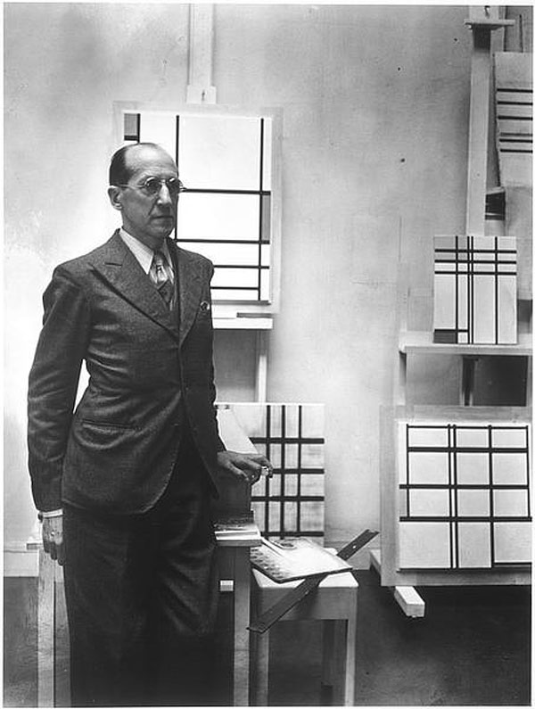 Rogi André (Rosa Klein), Mondrian, 1937
Edition of 1982, 51 x 41 cm
Gift of Mme Renée Beslon-Degottex 1982 - AM 1982-307
© Reserved rights
The Mondrian/De Stijl exhibition at the Centre Pompidou from 1st December 2010 to 21st March 2011 actually comprises two paths: one to explore Piet Mondrian, a prominent painter and leading light of 20th-century art in general and abstraction in particular, and the other to explore the De Stijl (“The Style”), movement, which Mondrian embraced and which swept across every realm of artistic creation – from painting to architecture, and on to sculpture, graphic arts, cinema and design – to become one of the main avant-garde movements that shook Europe after the turn of last century.
These two paths were mapped out by two curators, who have instilled their own distinct views, and generated a form of tension that casts light on the issues that the artist and the movement tackled in their day, on their distinct angles, and on how each approach complements the other.
Theo Van Doesburg, in a way, was the hinge between Mondrian and De Stijl. He and Mondrian exchanged views extensively until they went their separate ways in the early 1920s. Mondrian and De Stijl started out together, and then embarked on separate paths in their attempts to distil a universal artistic language and thereby build a new world.
The commonly accepted notion that Mondrian was a tutelary figure of the De Stijl movement is not completely true: it does not entirely tally with this artist’s slant, or with the broad spectrum of forces and people driving the movement (Van Doesburg emerged as its theoretician, but Vilmos Huszár, Bart Van der Leck, Georges Vantongerloo, Jacobus Johannes Peter Oud, Gerrit Rietveld and Robert Van’t Hoff also played prominent roles honing this “Style”).
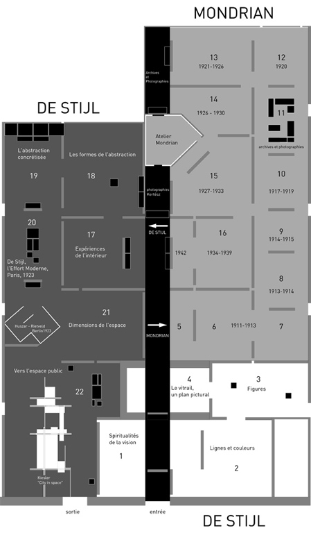 Exhibition floor plan
Architect - scénograph : Laurence Fontaine
The point of focussing on this seminal artist and prominent movement – which, again, are closely intertwined – is ultimately to take a new look at art in the early 20th century, and the people who shaped it, its international breadth and collective depth, the publications it spurred, the sources that inspired it and the influences that shaped it.
This double path will take visitors into the heart of this period’s milestone avant-garde phenomenon, and the full complexity that individual views intertwining into these collective endeavours spawned.
INTRODUCTION SEQUENCE
(DE STIJL 1/2 – ROOMS 1 TO 4)
The first four rooms showcase the De Stijl movement, but also provide a broader background. The exhibition starts in 1900, i.e. long before De Stijl began, by which time Mondrian had already established a fairly solid reputation in Holland. This part compares his work with the work of the other painters who later shaped the movement, to home in on the sources and aspirations they shared.
THE SOURCES: THEOSOPHY AND SYMBOLISM
The first Room – “The Spirituality behind the Vision” – casts new light on the Dutch symbolist and theosophical undercurrents that merged into the De Stijl movement, which Mondrian also researched (even though he gravitated away from them later on), and which rippled through early 20th-century art and architecture as far as Bauhaus.
The ecstatic gazes suggesting inner visions on the portraits and self-portraits, the geometry of the cosmos unveiled in mathematical grids by the de Lauweriks Dutch proportion school, and the spiritualistic dimension of art captured in generic form-thoughts unfurling apparently impelled by inner forces, draw visitors into the world view that various artists at that time were expressing. They captured the scientific and mystical theories that were budding in western societies in the late 19th century, stretched them into their artistic realms, and used them to spur their own research and the works of art they created as a result of it. Mondrian’s disturbing 1907 The Red Cloud is one example.
![]() Piet Mondrian, The Red Cloud, 1907
Piet Mondrian, The Red Cloud, 1907
Oil on cardboard, 64 x 75 cm
The Hague, Gemeentemuseum Collection
This eerie end-of-the-world landscape, which concurrently evokes the Big Bang and therefore origins, is a nice introduction. As it represents the sea and the sky, it may arguably also carry the essence of abstraction. The red cloud in the middle of the painting looks like it could stretch across its entire surface, and is unquestionably a form-thought: the shape and colour simultaneously encapsulate a notion and an emotion. It draws the mind into an endless loop, from the identifiable material landscape to the spiritual dimension it envelops and the abstraction in the shapes and colours, and back to the reality they conjure up.
Art critic and poet Yves Bonnefoy, who named a compendium of essays that he wrote about paintings after this particular one, described it thus: Two expanses, one azure-blue and the other green, separated by a line in which another blue and black intertwine, which a white thread renders upwardly iridescent, a moving centre, matter that suddenly becomes light, the large cloud’s orangey-red mass.
In his words, This painting that already looks so modern conceals a few of the more specific and indeed oldest categories associated with probing the divine – thus the ambiguous fairly blurry space opening up like roman painting to the non-dimensional depth of symbol, and yet with enough perspective for our aspects and motions to contribute their form and, with them, their hopes. Even the colour of the red cloud, the blue from the Virgin’s cloak, the emerald of Alchemy, the red that Delacroix used to bloodshed the ideal, once again in history strike the three fundamental chords of our condition, which wants to push back its boundaries.
(Yves Bonnefoy, Le Nuage Rouge, Paris, Mercure de France, 1992 [1977], p.127.)
LINES, COLOURS AND FLAT SURFACES
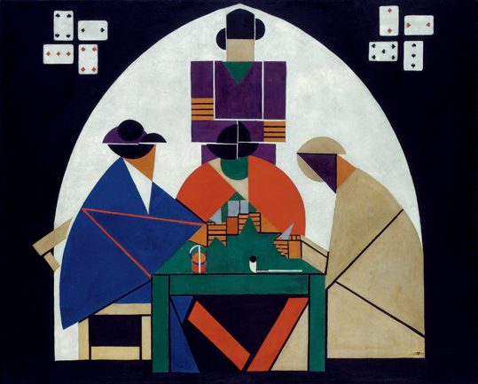 Theo Van Doesburg, The Card Players, 1917
Oil and tempera on canvas, 120.3 x 148.8 cm
The Hague, Gemeentemuseum Collection
The Fauve vein reaching back to the start of last century stretches on, into room 2, with a reflection on the role of lines and colours in a pictorial composition that assumes, and indeed lays claim to, the two dimensions of the canvas. This next room – Figure Analytics – shows where those reflections went from there, with a few creations by the more radical painters. Theo Van Doesburg’s geometric take on Cézanne’s The Card Players stands out, but Bart Van der Leck’s painting is no doubt the most revealing. This artist played a key role in the De Stijl movement when it started out and after Mondrian moved on. His 1916 The Storm was an influential step towards constructive abstraction.
 Bart Van der Leck, The Storm, 1916
Oil on canvas, 120 x 160 cm
Otterlo, Collection Kröller-Müller Museum
© Adagp, Paris
This imposing Bart Van der Leck painting self-explanatorily depicts a storm – a recurring phenomenon in 19th-century painting and, indeed, in Holland – but appropriates it with an amazing twist. The landscape and characters are in the elementary shapes, and plain primary colours and black areas. It all seems to be condensed onto one plane: the blue is the tempestuous sea, the red the shipwrecked boat, the yellow the shore and the black the cloaks of the women facing the wind and watching the tragedy unfurl. Because the storm wind is there in this composition: the feat that Van der Leck pulled off in this painting is that we can actually sense the wind blowing simply in the way he arranged the shapes and colours.
STAINED GLASS WINDOWS, BETWEEN PAINTINGS AND ARCHITECTURE
It was almost natural to transpose the decomposition of human figures that Bart Van der Leck and Theo Van Doesburg inter alia were working on by flattening colours and enclosing shapes, onto stained glass windows (which added a particularly interesting depth). As stained glass windows are hovering somewhere between paintings and architecture, they captured the full question of art integration, which De Stijl was broaching – and which indeed set the movement in motion. Theo Van Doesburg was aware of that: in 1917 (the year after discovering Van der Leck’s work on The Storm) he created a monumental three-part stained-glass window for the De Lange House.
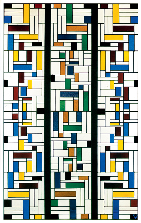 Theo Van Doesburg, Stained-Glass Composition IV (for the De Lange House in Alkmaar), 1917
Stained glass window, three sections, 286.5 x 56.6 cm each
Otterlo, Collection Kröller-Müller Museum
Each of the three sections towers almost three metres high. They combine geometric shapes (simple rectangles) with vivid colours (yellow, blue, red and green), black and white (the non-coloured glass that lets the light through). The middle part is built around a balance between red and green, and yellow and blue predominate in the two identical and symmetrical side panes. Most of the rectangles are distinctly elongated (like the panes holding them). The fact that some are vertical and others horizontal is what makes this composition dynamic. This work is completely abstract: the geometric shapes and colours add up to the stained glass window per se and, as they transform the light they radiate, they also contribute to constructing space.
MONDRIAN. THE PARISIAN YEARS, 1912-1938
After the first sequence introducing the sources that led to the De Stijl movement and Mondrian’s early paintings, the exhibition moves on to his years in Paris. The thread tying together his plastic conceptions is surprisingly clear in these 12 rooms. From the complex, packed intellectual ethos surrounding symbolism and theosophy, his work effectively, swiftly and indeed inexorably shifted to pure abstraction and Neoplasticism.
Neoplasticism This all-encompassing view of the world, which stems from acknowledging the universal force that is governing it, relies on a new harmony, the plastic expression of the balanced relationship, freed from the tragic feeling and the ‘obstacles’ of the description and shape that cluttered plastics before.
(Brigitte Léal, “Mondrian, Le Néo-Plasticisme, 1920. Presentation”, Mondrian Catalogue, p.81.)
“VERY ABSTRACT” CUBISM
(ROOMS 5, 6 AND 7)
Mondrian is one of the prominent painters of cubism, which he joined in 1911-1912 at the same time as Juan Gris, even though he is never mentioned in the history of cubism as anything but a marginal artist or epigone.
(Serge Lemoine, “L’Art de la Construction”, Mondrian Catalogue, p.31).
Piet Mondrian discovered Picasso’s and Braque’s cubist works, and the Cézanne paintings that had inspired them, in 1911. He swerved his research in that direction, and moved to Paris. His 1912 Still Life with Ginger Pot leaves no doubt that these influences left a lasting mark.
![]() Piet Mondrian, Still Life with Ginger Pot II, 1912
Piet Mondrian, Still Life with Ginger Pot II, 1912
Oil on canvas, 91.5 x 120 cm
The Hague, Gemeentemuseum, c/o The Solomon R. Guggenheim Museum, New York
This painting is organised around the blue circle denoting the ginger pot. It stretches into grey tones in a lean structure, which distils the broad lines and elementary shapes of the real image he perceived. The flat areas, facets and edges, and a few sketched impressions of depth, add up to a sort of rhythmic crisscross, which alone conjures up the constructed space. It vanishes before reaching the edge of the painting, merging the figure into the background with flawless control.
![]() Piet Mondrian, Composition Trees II, 1912-1913
Piet Mondrian, Composition Trees II, 1912-1913
Oil on canvas, 98 x 65 cm
The Hague, Gemeentemuseum Collection
Even though Still Life with Ginger Pot still arguably reflects something about its actual model and natural space, Mondrian’s next paintings show that he had completely appropriated the cubist artists’ approach by then. Guillaume Apollinaire wrote about Mondrian in 1913: [He] started out among the cubists, but never imitated them. His principal influence seems to be Picasso, but that has taken nothing away from his own distinctive personality.
Further down, he speaks of very abstract
cubism in relation to Mondrian. His series of paintings depicting trees are one example of this: the vertical and horizontal dynamics inspire him, and draw him closer and closer to abstraction. The fact that he chose trees as his motifs here also mirrors the theosophical notions he was musing over. Trees have roots that dig deep into the ground and yet reach towards the sky, affording them spiritual meaning and making them a symbol of the connection between the earth and sky.
Composition Trees II encapsulates Mondrian’s work and what he took from cubism as he gravitated towards abstraction, i.e. the lean lines, greyish zones and a composition that creates rhythm on the surface of the canvas but no longer pictures the trees’ silhouettes or winter atmosphere. It is clear, here, that abstraction, in this painter’s mind, is where what cubists started should end – he indeed criticised them for not following that path all the way. Cubists,
he said, snub the ultimate consequences of the plastic revolution that they themselves started. Modern sensitivity cannot be reduced to the integration of multiple viewpoints: it must tend towards a directly universal and rational plastic language.
ABSTRACTING REALITY
(ROOMS 8 AND 9)
Late evening, a flat area, vast horizon, the moon high above.
Y Such beauty!
X Such deep tones and colours!
Z So soothing!
Y So you find nature moving too?
Z If I didn’t, I wouldn’t be a painter.
Y As you have stopped painting nature, I thought you no longer found it touching.
Z To the contrary: nature stirs me very deep down. I am simply painting it another way.
Except, Natural Reality and Abstract Reality, published by Mondrian in the De Stijl Magazine in 1920 (republished in 2010 for the exhibition).
![]() Piet Mondrian, Composition with Colour Planes: Façade, 1914
Piet Mondrian, Composition with Colour Planes: Façade, 1914
Oil on canvas, 91.5 x 65 cm
The Hague, private collection, c/o Staatsgalerie, Stuttgart
The excerpt above shows that Mondrian’s abstraction is intimately connected to reality. He is trying to capture the deep-seated feelings it elicits. He gleans the main lines in his compositions from Parisian façades, as he had done from trees, to hone a universal pictorial language expressing the essence of nature and the essence of things. His 1914 Composition with Colour Planes: Façade is an example of his impressions when he saw Paris, the par-excellence modern city brimming with orthogonal facades and buildings reminiscing fences. This painting also shows the close ties between his work, architecture and cities.
When he left Paris and moved back to Holland, where he stayed throughout World War I, he was back among the seaside and other natural landscapes. His Plus-Minus paintings were another step: they are entirely made up of vertical and horizontal lines but nevertheless depict a landscape.
![]() Piet Mondrian, Pier and Ocean IV, 1914
Piet Mondrian, Pier and Ocean IV, 1914
Charcoal on paper, 51 x 63 cm
The Hague, Gemeentemuseum Collection
In his Pier and Ocean series, Mondrian expressed the tension between the man (vertical) and the ocean and sky (horizontal). His 1914 charcoal Pier and Ocean IV symbolises this frontal position and makes it palpable with the pier, which you can see at the bottom, in the centre of the sheet. Nestling the painting in an oval – an original ‘egg’, so to speak, and a recurring motif in his paintings during those years – elicits the perception of the horizon and suggests a notion of cosmic order (the shape is perfect). In this version, which is really more of a sketch, there are still a few slanting lines simulating depth and underlining perspective. That device disappeared later on, when he cut back structure to vertical and horizontal lines.
COLOUR PLANES. THE DE STIJL YEARS
(ROOM 10)
I construct lines and combinations of colours on flat surfaces to express, entirely conscientiously, general beauty.
(A letter from Mondrian to H.P. Bremmer dated 29 January 1914, quoted in the Mondrian Catalogue, p.22.)
Colour planes were already there in Mondrian’s cubist research, and became more prominent in his compositions inspired by Parisian facades. They became completely autonomous in his paintings from 1917 to 1919. The fact that he had met Bart Van der Leck had a lot to do with this (see The Storm above), as did the debate about elementary shapes that Theo Van Doesburg had set in motion – and which spurred the De Stijl movement.
![]() Piet Mondrian, Composition with Colour Planes II, 1917
Piet Mondrian, Composition with Colour Planes II, 1917
Oil on canvas, 48 x 61.5 cm
Rotterdam, Boijmans Van Beuningen Museum
Composition with Colour Planes II is one of a series of six paintings that Mondrian produced to explore colours and the flat aspect of paintings in more depth. Rarely has a painter gone to such lengths to refuse composition, and rarely has a painter depicted that refusal more precisely on a page,
wrote Thierry de Duve in his eminently enlightening commentary on the work he tendered in the exhibition catalogue (Thierry de Duve, “Face-à-Face”, Mondrian Catalogue, pp.49-50). He continued, The distribution of the planes is centrifugal and nonetheless rigorously static, it appears haphazard and is nonetheless never off balance, it is deliberately illogical and yet palpably self-evident.
These colour planes tie in tightly with the orthogonal grid. It is as if they completed the Plus-Minus: they structure the entire surface of the painting, but utterly uncompromisingly this time.
![]() Piet Mondrian, Composition with Grid III: Lozenge Composition, 1918
Piet Mondrian, Composition with Grid III: Lozenge Composition, 1918
Oil on canvas, 84.5 x 84.5 cm
The Hague, Gemeentemuseum Collection
Grids gained prominence in Mondrian’s paintings in 1918, and a seemingly innocuous or absurd development that same year proved pivotal: he rotated his paintings 45 degrees, hanging them from a corner. The first of these losangique paintings is a simple orthogonal grid of black lines on a white background. What Mondrian seemed to be saying when he tipped his paintings was that diagonal lines are actually horizontal or vertical, but somehow set straight at this new angle. Once the painting is hanging from a corner, the diagonal lines in the square do not only become vertical or horizontal: they gain amplitude. A new dynamic envelops the painting, the artist twists the vision’s common bearings, and the relationship between the work of art and its space takes a quantum leap. He built an all-new field of perception, a genuine landscape, which varying line thickness bring to life.
MONDRIAN IN WRITING
(ROOM 11)
The archive documents and photographs in Room 11 paint of picture of the Parisian ethos, and the stimulating exchanges that enriched the artistic scene during the days Mondrian lived here.
This room principally features the painter’s writing. The main documents have been republished for this exhibition (see the Bibliography at the end). His essays, articles (in particular the ones he published in the De Stijl magazine) and simple correspondence show that writing was an important part of the process he had embarked on to fine-tune his plastic language and disseminate his ideas.
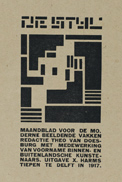 Vilmos Huszár. Cover of the first issue of De Stijl Magazine, October 1917
Printed paper
The Hague, Gemeentemuseum Collection
That was why Mondrian assured Theo Van Doesburg, who was starting the De Stijl Magazine at the time, that he could count on him. In his successive contributions in successive issues, he implicitly or explicitly challenged his contemporaries with his thoughts and views on painting, on how it should evolve, and on how it connected with reality. He published what would become one of his most memorable essays, Natural Reality and Abstract Reality, in De Stijl. It was actually an edu-taining trialogue between a painting enthusiast, a naturalist painter and an abstract-realist painter.
Mondrian stopped contributing to this magazine in 1923, when his views started clashing more seriously with its editorial line. He nevertheless continued to consider writing as a fundamental endeavour and it remained central to his approach.
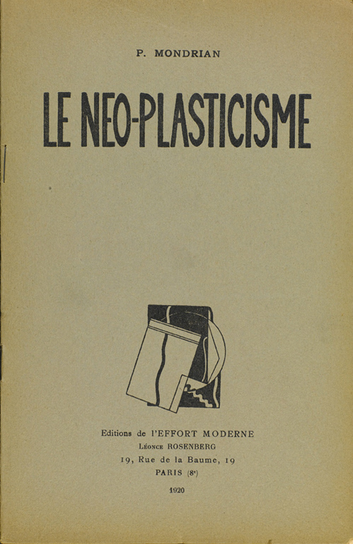 Piet Mondrian, Neo Plasticism: The General Principle of Plastic Equivalence
Paris, Editions de l’Effort Moderne. Léonce Rosenberg, 1920
Brochure, 24 x 16 cm
Paris, Centre Pompidou, Bibliothèque Kandinsky
Mondrian published his brochure about Neo Plasticism through L’Effort Moderne in 1920. Brigitte Léal, the curator of the exhibition who wrote the preface for the republication today, explains, Mondrian’s essay was written amid a feverish bout of cubist, futurist, Dadaist and constructivist manifestos and manifestations in the 1920s, and with his debate with Van Doesburg in the background. It makes a compelling case for the supremacy of Nouvelle Plastique over its Dada and futurist rivals. Neoplasticism creates a new form of beauty. With neoplasticism, ‘ART NOUVEAU WAS BORN’
(Brigitte Léal, “Mondrian, Le Néo-Plasticisme, 1920. Présentation”, Mondrian Catalogue, p.81.)
BALANCE IN DISSYMMETRY – MODULAR VARIATIONS
(ROOMS 12 AND 13)
Mondrian’s paintings around about the time he published Le Néo-Plasticisme, in a way, are a culmination of his thoughts until then. The universal vocabulary that he had honed by gradually stripping everything else materialised in black horizontal and vertical lines, and the three primary colours (red, yellow and blue). The even checkering and orthogonal grids, however, have gone, and dissymmetry is indeed one of the keys to this composition.
![]() Piet Mondrian, Tableau I, with Red, Black, Blue and Yellow, 1921
Piet Mondrian, Tableau I, with Red, Black, Blue and Yellow, 1921
Oil on canvas, 103 x 100 cm
The Hague, Gemeentemuseum Collection
The painting called Tableau I, with Red, Black, Blue and Yellow captures this turning point in Neoplasticism. The thick black lines isolate vast rectangles. A few are filled with bright colours and others with “non-colours”, i.e. black, grey and white. The composition is dissymmetrical and not bound by the frame. The lines and colour planes seem to stretch beyond the canvas, and the red actually seems to be mostly off it. The dynamic black lines and flat colours, and the rhythm they create together, also create balance, which stretches way beyond the surface of the canvas.
Yes, all things originated in a whole: each part receives its visual value from the whole and the whole receives it from the parts. Everything is constituted by relation and reciprocity. Colour does not exist other than by another colour, the dimension is defined by the other dimension, there is only position in opposition to another position. That is why I say that rapport is the principal thing.
(Mondrian, Natural Reality and Abstract Reality, 1920).
In this perspective, each component blends into and is part of the rest. The “rapport” Mondrian is talking about applies to the painting but, by extension, also applies to the human community. In this light, his plastic research to create balance that is at once perfect and vibrant was this painter’s way of literally changing the world.
![]() Piet Mondrian, Drawing Booklet, 1925
Piet Mondrian, Drawing Booklet, 1925
Part B: The Lozenge Compositions, 1926
Pencil on paper, 23.2 x 29.8 cm
New York, The Pace Gallery
A few pages from a sketchbook in an exhibition provide a behind-the-scenes glimpse of the artist’s process. They are quick sketches of possible compositions in a square, lozenge or rectangle, and capture the underlying thoughts about proportions and arrangements for the colour planes in each one.
USING COLOUR TO BUILD SPACE
(ROOM 14 AND THE REBUILT ATELIER)
![]() Piet Mondrian, Design for the library-study of Ida Bienert, also known as “Salon de Mme B…, in Dresden”, 1926
Piet Mondrian, Design for the library-study of Ida Bienert, also known as “Salon de Mme B…, in Dresden”, 1926
A view of an open box
Gouache and pencil on paper, 75 x 75 cm
Dresde, Staatliche Kunstsammlungen, Kupferstich-Kabinett
As Neoplasticism set out to change the world, it made sense to branch out into rearranging spaces, and therefore into architecture. On that front, however, Mondrian only produced one theatre backdrop, for The Ephemeral is Eternal, a play by his friend, writer and art critic Michel Seuphor. All that is left of those backdrops are a few photographs, projected on an interior decor for collector Ida Bienert – which was never completed but was nevertheless a major milestone in this painter’s career: he used the orthogonal grid to work on the relationship between the lines and colours in space. Using an open box, a device that De Stijl artists were fond of (see below), was this artist’s way’ of broaching architecture as a pictorial composition, i.e. pure plastic art. In Mondrian’s view, paintings were parts of a whole, and he also used his drawings for the Ida Bienert project to illustrate his Le Home – La Rue – La Cité article in Vouloir, a magazine, where he advocated phasing out painting in a coloured environment.
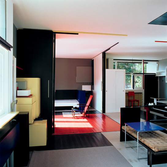
 Reconstruction, Mondrian’s Atelier at 26, rue du Départ, Paris
The atelier in 1926
Scale 1:1, based on Frans Postma’s plans, 1994-1995
Haarlem, Collection Link
Finally, Mondrian only really applied Neoplasticism to an indoor setting in his own atelier, which has been rebuilt within this exhibition using period photographs and art historian Frans Postma’s findings.
In his book about Mondrian, after describing the rundown building in rue du Départ and the constricted flat where the artist led a very precarious life, Michel Seuphor described the atelier thus: It was a fairly large room, it was very light and had a very high ceiling. Mondrian had divided it unevenly, using a large wardrobe painted black, which was in turn partly concealed by an idle easel covered in large red, grey and white cardboard boxes. There was another easel against the large wall at the back, which often changed aspect, every time Mondrian exercised his neo-plastic genius on it.
(Michel Seuphor, Mondrian. Sa Vie, Son Œuvre, Paris, Flammarion, 1956/1970, pp.158-159. Quoted in the exhibition catalogue, p.109.)
Mondrian’s atelier became a work of art in and of itself. Alexander Calder’s experience when he visited it in 1930 made a deep impression on him. That seminal exchange shifted that sculptor’s entire work (his thoughts and how he applied them).
BEYOND PAINTING
ROOMS 15 AND 16
![]() Piet Mondrian, Composition with Red, Blue and Yellow, 1930
Piet Mondrian, Composition with Red, Blue and Yellow, 1930
Oil on canvas, 46 x 46 cm
Zurich, Kunsthaus
Aside of the atelier, which was in a category of its own because it was where the artist worked and lived, Mondrian never really applied Neoplasticism to architecture. He did not seem particularly keen on doing so either, as he never finished the only interior-design commission on record, the Salon de Mme B. This was plausibly because paintings, far from the artifices – or constraints – of the third dimension, were where Mondrian conquered space and transformed it.
In the late 1920s, his paintings started radiating fresh intensity with large colour areas, which were often red. These paintings seemed to want to prevail, and harness their intensity to absorb the environment and the spectator.
![]() Piet Mondrian, Composition in Red, Blue and White, II, 1937
Piet Mondrian, Composition in Red, Blue and White, II, 1937
Oil on canvas, 75 x 60.5 cm
Paris, Centre Pompidou, Musée national d’art moderne
Sometime later, lines came back with a bang, and flourished across several compositions (apparently to play their structuring role more assertively) and colour withdrew to the sidelines and fringes of the paintings, as we can see in one of the only two Mondrian works in the Musée national d’art moderne’s collections, his 1937 Composition in Red, Blue and White: II. There is a flashback of sorts to the Pier and Ocean period, as the crossing lines entirely take over.
CONCLUSION: AN OPEN DOOR IN AMERICA AND FRESH MOMENTUM
If Mondrian was never overly keen on applying Neoplasticism to architecture, he was nevertheless earnestly interested in his relationship with architecture and indeed cities (as we have seen). Cities – Paris in 1912 and New York in 1940 – play a full role in his efforts to create his artistic vocabulary, as much through their shapes as through his experiences of them.
![]() Piet Mondrian, New York City, 1942
Piet Mondrian, New York City, 1942
Oil on canvas, 119.3 x 114.2 cm
Paris, Centre Pompidou, Musée national d’art moderne
New York City echoes the cubist façades from the 1910s, and encapsulates the power that Mondrian senses in built-up environments and the life thriving in them. This painting is poles apart from the rigid stones of Paris. It is the end of the exhibition, and a new start. The coloured lines (paper strips and braids, apparently to raise the pattern) are this painter’s way of capturing the streets at right angles and the vertical skyscrapers, as much as the buoyant life there and the pace it sets, drawing on the jazz tunes he discovered there. Mondrian’s arrival in the US opened a new door, and brought fresh momentum to his artistic work.
DE STIJL (2/2) – “FROM THE MIND TO THE CITY”. FROM A VISION OF SPACE TO A PROJECT FOR SOCIETY
The De Stijl experience shows how Mondrian and his fellow De Stijl artists started roughly in the same place and then followed an amazing variety of paths, and created similarly abundant art. This path is not chronological: each room broaches a different theme and takes one step further into the minds behind this movement and the life within it, not unlike the chapters of a book.
De Stijl Magazine was founded in October 1917, and opened up a forum for fertile exchanges on the integration of the arts and on defining a universal style for the world to come. A manifesto advocating its collective dimension was published in 1918, when the movement was created. It was signed by painters Theo Van Doesburg, Wilmos Huszár and Piet Mondrian, poet Antony Kok, sculptor Georges Vantongerloo and architects Jan Wils and Robert Van’t Hoff. It is this movement’s founding text.
INTERIOR EXPERIENCES
(ROOM 17)
The first room is about rearranging interior spaces and the several major achievements it showcases cast light on the hurdles that painters and architects had to negotiate when they worked together.
The fact that Bart Van der Leck left the group early on as he sustained that architects had nothing to do in this movement (along with Mondrian’s qualms) was a sign that these artists did not find the connection between art and architecture simple or natural. The issue for the painters, no doubt, was to avoid being relegated to the ranks of interior decorators following architects’ orders.
Van Doesburg and Huszár tried several times to work on milestone projects with architects such as Jacobus Johannes Pieter Oud, Robert Van’t Hoff and Gerrit Rietveld, who had joined De Stijl, with a view to tangibly encapsulate the neoplastic vision that they shared, in buildings.
 Theo Van Doesburg. Colour Scheme for a Room in the House of Bart van der Ligts in Katwijk aan Zee, 1919-20
Pencil, Indian ink and gouache on tracing, 60.5 x 43 cm
Rotterdam, NAI (Netherlands Architecture Institute), Van Doesburg Archives
Theo Van Doesburg worked with architect Robert Van’t Hoff on the interior decoration for Bart van der Ligts’ house in 1919. Their research into integrating colour into indoor space unleashed a quantum leap in representation methods and the notion of interior architecture. The artists used the open-box principle here to simultaneously match the floor and the four walls. They arranged large red, green and blue rectangles, and underlined them with a few black lines on the room’s white walls to utterly deconstruct the indoor space through their relations: Working with Robert Van’t Hoff on Bart van der Ligts’ house allowed Theo Van Doesburg to cooperate using a new approach, and thereby to completely achieve the ideal architectonics of relationship: the large colour planes stand out on the walls and break up the room’s cubic shape, and allow Gerrit Rietveld’s furniture to float in the space.
(Frédéric Migayrou, “Une Architectonique des Dimensions”, De Stijl Catalogue, p.181.)
 Theo Van Doesburg (colour) and Jacobus Johannes Pieter Oud (architect), Project for a Workers’ Housing Complex (blocks VIII and IX) in Spangen, Rotterdam, 1920-1923
Theo Van Doesburg, preparatory drawing to colour the facade looking out onto Potgieterstraat on block VIII, 1921
Black ink and gouache on tracing, 15.7 x 25.6 cm
Paris, Fondation Custodia, Frits Lugt Collection
© Adagp, Paris
As we said earlier, stained glass windows played a prominent part in this drive to blend the pictorial approach into constructed spaces. We can see it in this worker housing complex in Spangen, but Van Doesburg’s goal on this project with Oud was to take neoplasticism out into the street. At his initiative, art and architecture became clearly more intent on expressing and transforming post-war industrial society.
J.J.P. Oud was a municipal architect in charge of housing in Rotterdam from 1918 to 1933. He brought to life his thoughts on architecture and cities, by combining a monumental approach and a social vision that necessarily entailed a collective dimension. The workers’ housing programme he was assigned in Spangen Polder is a textbook example. Theo Van Doesburg originally created a series of stained-glass windows for these brick buildings. Then he took his efforts to integrate neoplasticism into architecture and cityscapes one step further by adding colour to the building facades. The deliberately asymmetric layout he designed using three colours – yellow, blue and green – along diagonal lines contrasted with the brick and broke up the linear aspect of the imposing buildings. But that was as far as his teamwork with this architect got: Oud felt that this polychromy and composition went too far de-structuring his architecture.
THE FORMS OF ABSTRACTION
(ROOM 18)
The next room is a step back in time to the genesis of abstraction in the De Stijl movement. Piet Mondrian, Bart Van der Leck, Vilmos Huszár and Theo Van Doesburg played prominent roles individually, and collectively through their exchanges. Van Doesburg tendered a new, and abstract, take on Cézanne’s Card Players, Vilmos Huszár blurred the bearings of representation with his Hammer and Saw, and Van der Leck took a new step towards breaking down figures and movement into shapes and colours with his large triptych dubbed The Mine.
 Bart Van der Leck, Composition 1916, No. 4 (The Mine), 1916
Oil on canvas, 113 x 222 cm
Otterlo, Kröller-Müller Museum Collection
© Adagp, Paris
This painting is abstract but, like many others at the time, still toys with a figurative dimension in its title and composition. The blue, red and yellow lines on the white pane in the middle hint at the landscape and the vertical yellow line in the centre suggests the mine entrance. The narrower black panes on either side show two miners working in the galleries, with the lights from their helmets. The fact that the subject has a social undertone is meaningful: as we have seen, far from a mere aesthetic vision, the De Stijl movement was a vision of the world. It entailed a social and ideological stance, and several of the painters went as far as deriving political programmes.
The fact that it is a triptych – which is an unusual option both to broach a social issue and for an abstract painting – is also interesting. Triptychs are nevertheless common among De Stijl artists, who see them as a way of combining instant perception and the time element associated with a story. The structure and arrangement also alters the way in which the work and the wall – and the way in which the viewer and the work – interact.
Despite the variety of interpretations, triptychs remain for De Stijl the instrument that hovers between art and architecture, and between identity and repetition; the one that denotes the limits of transfer, a threshold that shuffles the identity-related conceptions of painting. Ultimately, it appears as the way of articulating the material and spiritual worlds, the realm of reality and a new form of representation.
(Frédéric Migayrou, De Stijl path exhibition curator, “Dossier 5. Triptyques”, De Stijl Catalogue, p.98.)
ABSTRACTION MATERIALISING
(ROOM 19)
The effervescence that surrounded this movement’s inception soon prompted De Stijl to move abstraction into new realms of creation such as films (see Philippe-Alain Michaud’s article in the De Stijl catalogue), graphic arts, sculpture and design. Abstraction materialised in design in 1918, with a milestone in 20th-century art history and design: Gerrit Rietveld’s now famous Red Blue Chair.
 Gerrit Rietveld, Red Blue Chair, 1918
Plywood and beech, 86.6 x 65.9 x 82 cm
Utrecht, Centraal Museum Collection, Donation, 1959
© Adagp, Paris
Marek Wieczorek found an interesting parallel between the way space and colour interact in Mondrian’s Composition with Red, Blue, Black, Yellow and Grey and Gerrit Rietveld’s Red Blue Chair. In Wieczorek’s words, Ironically, Rietveld also had a “functional” way of using colour: on his chair, the yellow highlights the ends of the rods, giving the impression that they are radiating some sort of force outwards, whereas the cold blue creates a form of withdrawal that draws you towards the seat. The red, on its part, makes the thin plywood back look more solid.
He then compares the structure of the chair with Mondrian’s line layout: Rietveld plays on the crisscrossing and extension of the rods beyond the chair itself.
(Marek Wieczorek, “Le Paradigme De Stijl”, De Stijl Catalogue, p.68.)
In several ways, the Red Blue Chair, which was originally neither red nor blue but wood-coloured, can indeed resemble a Mondrian composition with the third dimension. Rietveld was the man who created the only authentically neoplastic architectural creation, the Schröder House. Interestingly, Mondrian and Rietveld never met. The dialogue between their works in spite of that is no doubt the sign of the powerful collective dimension of the De Stijl approach, over and above the mere relationships between the people in it.
When critics claimed that the chair was uncomfortable, Rietveld’s reply was straightforward: You are absolutely right. I hurt my ankles on the bits that stick out. But, on the other hand, it’s not really a chair: it’s a manifesto.
(Quoted by Christoph Blaas, “Dossier 7. Chaise Rouge-Bleu, 1918”, De Stijl Catalogue, p. 146.)
De Stijl concepts also reached a number of Bauhaus students via Van Doesburg. He travelled to Weimar in 1921-1922, his bid to join the Bauhaus community was declined, and he started running parallel lectures that attracted a fairly large number of students. De Stijl ideas and forms nevertheless made a mark in Weimar, and Van Doesburg’s perceptions proved pivotal to the Bauhaus reform and industrial inroads (orchestrated by Gropius) that were already in the wind when he was there.
(Christoph Blaas, “Dossier 8. Theo Van Doesburg et le Bauhaus, 1921-1922”, De Stijl Catalogue, p.148.)
THE DE STIJL EXHIBITION IN THE L’EFFORT MODERNE GALLERY, 1923
(ROOM 20)
As soon as he founded the magazine in 1918, Theo Van Doesburg started doing everything in his power to bring the “Stijl” to life on Europe’s artistic scene. He fervently advocated total art, wrote, lectured and taught intensively, and repeatedly teamed up with artists and architects to hone his art.
Mondrian introduced him to Léonce Rosenberg, a gallery owner, in 1920. Rosenberg volunteered to host the venue for the one event that De Stijl lacked to earn its legitimacy: an exhibition. That exhibition, Les Architectes du Groupe De Stijl, took place in the L’Effort Moderne Gallery in 1923. [It] remains a milestone in 20th-century history, and the culmination of all the major trends that shaped De Stijl.
(Gaëlle Grivaud, “Dossier 6. Exposition “Les Architectes du Groupe De Stijl”, L’Effort Moderne Gallery, De Stijl catalogue, p.94.)
![]() Theo Van Doesburg and Cornelis Van Eesteren, Particular House, 1923
Theo Van Doesburg and Cornelis Van Eesteren, Particular House, 1923
Contra-construction, 1923
Print enhanced with gouache, 57 x 57 cm
New York, The Museum of Modern Art
Among the 50-odd scale models, project photographs and drawings by Huszár, Oud, Mies Van der Rohe, Jan Wils and Piet Zwart, a few drawings with a distinctly new style stand out: Theo Van Doesburg made them while he was working with Cornelis Van Eesteren, a young Bauhaus architect he had met. He used this particular representation method called contra-construction to enhance the presentation of a ‘particular house’ for Léonce Rosenberg. The style was closely intertwined with the De Stijl notion of space, and poles apart from the planes and elevations that only provide a stilted, limited view of architecture: these drawings tendered a dynamic approach for the planes and lines that shaped them: the colour-enhanced floors and walls seem to hang in space. Their interaction seems to add movement, and reveals the architectural volumes and how they articulate with each other. The term contra-construction means deconstructing and breaking up architecture’s very conception.
Theo Van Doesburg and Cornelis Van Eesteren gave modern architecture new representation options, which were closer to its message. Their systematic use of axonometrics drains the subjectivity from the representation and sidesteps the optical illusion of perspective. The parallel straight lines and plans provide an objective angle on the geometric relations, and distance vis-à-vis the object they represent.
THE DIMENSIONS OF SPACE
(ROOM 21)
The core of the question about representing architecture with these contra-constructions is the relationship between space and its dimensions. The question about the fourth dimension (movement) is central to Theo Van Doesburg. Drawing on work by mathematician Hendrik De Vries and research by futurist thinkers (in particular Gino Severini), he argued that it was possible to express it using tesseracts (succinctly, tesseracts are to cubes what cubes are to squares, i.e. they add one dimension).
This is a thorny issue, and indeed what eventually led Mondrian to break away, on the grounds that The concept of the fourth dimension asserts itself in and of itself in the new art as a partial or complete destruction of the three-dimension naturalist representation.
(Quoted in the De Stijl Catalogue p.25). He said the same thing more simply when Calder visited his studio and suggested he would like to see his paintings moving: My paintings already move very fast.
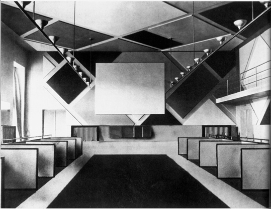
 Vilmos Huszár and Gerrit Rietveld. Views of the scale model for Space-Colour-Composition, for the Juryfreie Kunstschau Exhibition, Berlin, 1923
L’Architecture Vivante, Autumn-Winter 1924, plates 10 and 11
Dr
To treat visitors to a firsthand experience of the way De Stijl artists broached the issue of the dimensions of space, this exhibition’s curators rebuilt an installation that Vilmos Huszár and Gerrit Rietveld had created for the Juryfreie Kunstschau Exhibition in Berlin in 1923: Space-Colour-Composition. Huszár was originally unhappy with his original mandate to add colour to an exhibition venue, and called in architect Gerrit Rietveld to “bring it to life”.
The result, two interlocking rooms connecting around a central partition, with flat, even coloured surfaces on the walls, directs visitors’ feet and eyes, guides them, and alters their perceptions. The black strips on the walls and floor structure the areas, and the yellow, red and blue colour planes cover a few of the angles, perhaps to conceal them. The architect had a role to play mapping out path, the open and closed areas, the empty and full areas, but the painter’s colours are what really create this place and the visitor’s experience.
The teamwork between these two men is one of the finest examples of De Stijl concepts at work.
Fundamentally, the architectonic space should only be considered as a blind, shapeless void as long as colour has not effectively afforded it spatial form. The 20th-century’s painting that creates space-time makes artists’ big dream – placing people in their painting, not in front of it – come true. At the end of the day, the surface is the only decisive factor for architecture: people do not live in the construction but in the atmosphere that the surface creates!
(Theo Van Doesburg, “Les Couleurs dans l’Espace et le Temps”, published in the De Stijl Magazine, in 1928, catalogue De Stijl, pp.261-262.)
DE STIJL: BREAKING OUT INTO THE OPEN
(ROOM 22)
This exhibition meaningfully ends with an overview of prominent De Stijl achievements to broach the issue of cities and public areas. Gerrit Rietveld’s Schröder House is a neoplastic masterpiece and unquestionably this drive’s main exponent.
Gerrit Rietveld, Schröder House: interior, child’s bedroom, 1st floor, 1924
Utrecht, Centraal Museum Collection, Rietveld-Schröder Archives
© Adagp, Paris
Gerrit Rietveld, Schröder House, Prins Hendriklann 50, Utrecht, 1924
Outside view in 1993
Utrecht, Centraal Museum Collection, Rietveld-Schröder Archives
© Adagp, Paris
This house was built in Utrecht in 1924 at Truus Schröder’s request. She wanted a home for her family (she had three children), and a house to showcase that city’s artistic avant-garde. The open-plan layout and sliding partitions are organised around a central ‘hub’ and an array of open volumes projecting outwards. Rietveld’s architectural design and the way in which the distinct components are arranged make this house perfectly ‘constructed’ and concurrently utterly ‘structure-less’ by mastering and playing with volumes, surfaces and colours.
With the Schröder House, Rietveld invented a model, provided an opportunity to experiment a new lifestyle, and broke away from middle-class codes.
(Aurélien Lemonier, exhibition co-curator for the De Stijl path, “Dossier 11. Maison Schröder, Utrecht, 1924”, De Stijl Catalogue, p.196.)
 Theo van Doesburg, a view of L’Aubette Cinema and Dance Hall, 1928
Original print
The Hague, RKD (Netherlands Institute for Art History)
L’Aubette, a café, cinema and dance hall, was another momentous De Stijl breakthrough (and was recently reconstructed). Van Doesburg’s mandate in 1926 was to work on revamping a former café, restaurant and dance hall. He worked on it with Sophie Taeuber (the tea room) and Hans Arp (the dance room). Van Doesburg did a lot more than add decorative art: his colour compositions reach monumental proportions and effectively construct space.
Revamping L’Aubette was a milestone on Van Doesburg’s path to “elementarism”, the artist’s elementary vocabulary using basic shapes, straight lines, and only the three primary colours, black and white.
Elementarism opposes the compromise, decadence and aesthetic confusion (neo-classicism, surrealism, etc.) and the narrow-minded dogma of today. It reduces all spiritual endeavours and techniques to their most elementary form. It springs from functional thought, recognises the latent energy in matter (colour, glass, iron, cement, sounds and words) and sees architecture as a construction method that synthesises every function of human life.
(Theo Van Doesburg, “L’Élémentarisme et son Origine”, published in the De Stijl Magazine in 1928, catalogue De Stijl, p.263.)
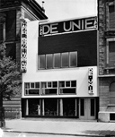
Jacobus Johannes Peter Oud, Café De Unie façade, Rotterdam, 1925
Original print
Paris, Centre Pompidou, Bibliothèque Kandinsky
© Adagp, Paris
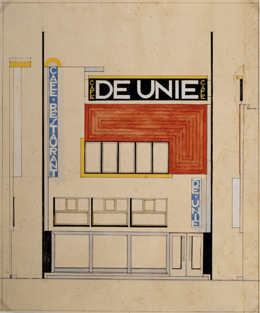
Jacobus Johannes Peter Oud, Café de Unie, Rotterdam, 1925
Colour pencils, Indian ink, watercolour and gouache on paper, 37.7 x 31.2 cm
Paris, Centre Pompidou, Musée national d’art moderne
© Adagp, Paris
Oud also took on a leisure spot, Café De Unie, in Rotterdam in 1925. But he worked on the outside, breaking it out from the uniform street-facing façades around it with an asymmetric, coloured and light-steeped graphic and plastic composition. He interlocked squares and rectangles, two large horizontal and vertical white strips, and a flat red area featuring a theosophical motif balancing out a set of signs of various sizes, to afford this façade its own distinct identity, which the architect himself defined as “destructive”. Oud’s provocative angle sparked outrage in the neighbourhood but soon earned him an international reputation as A virtuoso architect, who has broken free from classical form, in a liberating endeavour brimming with humour.
(Christoph Blaas, “Dossier 12. Café De Unie, Rotterdam, 1925”, De Stijl Catalogue, p.204).
One interesting thing that the Schröder House, L’Aubette and this promotional façade have in common is that they capture the fact that, in the 1920s, the De Stijl movement placed public areas – and indeed cities themselves – at the core of its agenda.
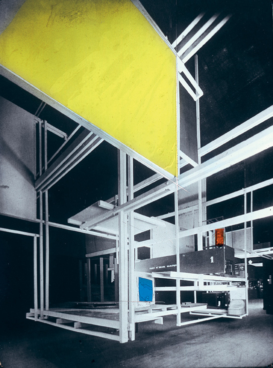 Frederick Kiesler, view of the City in Space Installation, International Exhibition of Modern Industrial and Decorative Arts, Grand Palais, 1925
Re-coloured glass plate, circa 1930
Vienne, Kiesler Foundation
That same year, Austrian architect Frédérick Kiesler’s installation at the International Exhibition of Modern Industrial and Decorative Arts in Paris also captured this all-encompassing perspective. City in Space (as Kiesler renamed it) was originally designed as a stage or set backdrop but then grew into a prototype for a city. It is a suspended structure holding a series of floors and levels. The screen-like hangings in certain areas provide vertical planes, and were probably originally coloured.
This impressive hanging megastructure looks like a “practicable contra-construction” (Aurélien Lemonier, “Dossier 10. 1925, Cité dans l’Espace, International Exhibition of Modern Industrial and Decorative Arts, Paris”, De Stijl Catalogue, p.152) and has been entirely rebuilt at the exhibition venue to treat visitors today to its “magical force of attraction” (Kiesler, quoted in the catalogue). This spectacular work of art condenses and expresses the full compendium of philosophy of the city. It takes us back to the basic notions of a movement that always strove to think about structures together – structures, that is, on a the surface of a painting or organising people’s life, indistinctly.
TIMELINES
MONDRIAN
7 March 1872
Pieter Cornelis Mondriaan born in Amersfoort, The Netherlands.
1892
Joined the Academy of Fine Arts in Amsterdam.
1897
Joined Saint Luke, an artist society that organises annual exhibitions at the Stedelijk Museum in Amsterdam.
Painted traditional portraits, and church and home decors, on commission. Also painted landscapes in a more symbolist vein. Focused in particular on the components that added rhythm to the composition (trees, barriers) and flatness (high horizons to cancel out depth).
1904-1906
Painted mills, ricks and the River Gein. His paintings gravitated towards expressionism and fauvism.
1908
Painted the church, lighthouse, dunes and sea with dividing touches and plain colours.
1909
Spoor, Mondrian and Sluyters retrospective at the Stedelijk Museum in Amsterdam. Joined the Netherlands Theosophical Society.
1911
First stay in Paris. Possibly visited the Salon des Indépendants with its room 41, the first big collective milestone of cubism.
1912
Settled in Paris, drew on cubist artists, and painted nudes, still lives and Parisian buildings. The real views vanished behind the crisscrossing geometric lines and monochrome colour touches.
1913
Exhibited at the Salon des Indépendants. Guillaume Apollinaire wrote about his “very abstract cubism”.
1914
Moved back to Holland, stayed there until World War I ended.
1915-1916
Met Theo Van Doesburg, theosophical thinker Schoenmaekers and Bart Van der Leck. His paintings are made up of coloured planes or lines forming “pluses and minuses”.
1917
Published a series of articles in the De Stijl Magazine.
1919
Returned to Paris.
1921
Léonce Rosenberg’s L’Effort Moderne gallery published Le Néo-Plasticisme. Principe général de l’équivalence plastique (“Neo Plasticism. The General Principle of Plastic Equivalence”). The first neoplastic paintings: primary-colour or black squares and rectangles arranged into asymmetrical chequered lines. Used planes in an attempt to destroy space and volume, and thereby step beyond visible nature.
Took part in the Les Maîtres du Cubisme exhibition at the L’Effort Moderne gallery.
Settled at 26, rue du Départ.
1922
Retrospective for his 50th birthday at the Stedelijk Museum in Amsterdam.
1923
Met Michel Seuphor. Took part in the first major De Stijl exhibition, in Berlin.
1924
White backgrounds and black lines gained prominence in his paintings.
1925
Parted ways with Van Doesburg.
1927
Katherine Dreier exhibited his work in the US for the first time. Published an article on “Jazz and Neo-Plasticism”.
1930
Contributed with the Cercle et Carré group exhibition and magazine.
1931
Joined the Abstraction-Création association.
Van Doesburg died.
1932
Switched to double lines, as an autonomous plastic resource.
Retrospective for his 60th birthday at the Stedelijk Museum in Amsterdam.
1934
Attended a Louis Armstrong concert at Salle Pleyel.
1935
Cubism and Abstract Art exhibition at the Museum of Modern Art, New York.
1937
Origines et Développements de l’Art International Indépendant exhibition at the Jeu de Paume Museum, organised by Christian Zervos.
1940
Moved from Paris to London in 1938, then on to New York. Harry Holtzman, an American painter he had met six years earlier in Paris, helped him to find accommodation and introduced him to Boogie-Woogie.
1941
Exhibited New York City, a series of coloured lines.
1 February 1944
Mondrian died.
1945
Retrospective at the MoMA.
1957
Mondrian, l’Organisation de l’Espace exhibition at the Denise René Gallery in Paris.
1969
Last retrospective in France at the Orangerie, organised by Michel Seuphor.
DE STIJL
1914
Mondrian returned to Holland. Theo Van Doesburg was drafted and stationed on the Belgian frontier, where he met Evert Rinsema and Antony Kok, two poets.
1915
Van Doesburg’s first article about Mondrian’s work, which he had recently discovered.
1916
Mondrian introduced Van Doesburg to Schoenmaekers, a theosophical thinker.
Van Doesburg met architects Jacobus Johannes Pieter Oud and Jan Wils, and painter Bart Van der Leck, and they started working together, inter alia on stained glass windows and colour for indoor areas.
Robert Van’t Hoff built Henny Villa in Huis-ter-Heide. Its geometric radicality earned it an international reputation.
Helene Kröller-Müller acquired Van der Leck’s work, which was verging on abstraction (simplified shapes, flat primary colours).
1917
Van Doesburg painted his first neoplastic Compositions using geometric grids as per Mondrian’s prescriptions.
The first issue of the De Stijl Magazine was published in October. This magazine was published until 1932.
1918
Gerrit Rietveld fine-tuned his first Red Blue Chair.
Van Doesburg designed the colour scheme for De Dubbele Sleutel (a hotel and restaurant built by Wils) and the Bart De Ligt House (designed by Van’t Hoff). He also made the stained-glass windows for a housing development in Spangen polder in Rotterdam (built by Oud).
First De Stijl manifesto.
1919
Mondrian left for Paris.
1920
Van Doesburg, Mondrian’s host in Paris, met L’Effort Moderne Gallery director Léonce Rosenberg.
Second De Stijl manifesto, on literature.
Van Doesburg took on a nom de plume, I.K. Bonset, a Dadaist poet. Organised the La Section d’Or-Paris. Kubisten en Neo-Kubisten exhibition in Holland.
December 1920 to January 1921: Van Doesburg stayed in Germany, and visited the Bauhaus run by Walter Gropius in Weimar.
1921
Van Doesburg worked with architects full-time. His conception of colour as an agent to instil dynamics and de-structure architecture led Oud to break away from De Stijl.
Meeting with Tristan Tzara.
April 1921 to end-1922: Van Doesburg settled in Weimar. The magazine opened its doors to new authors including Hans Richter, Kurt Schwitters and Raoul Hausmann.
Third De Stijl manifesto: Towards a New World Plasticism.
1922
Van Doesburg lectured on De Stijl, parallel to Bauhaus.
Met Dutch architect Cornelis Van Eesteren, they started working closely together.
1923
Van Doesburg, Nelly Van Moorsel, Kurt Schwitters and Vilmos Huszár went on the “Dada Tour” in Holland.
Huszár and Rietveld presented a Space and Colour Composition for Exhibition for the Berlin Juryfreie Kunstschau.
October and November: Les Architectes du Groupe De Stijl exhibition at the L’Effort Moderne Gallery. Van Doesburg and Van Eesteren offered three projects for houses, which they called contra-constructions.
1924
Gerrit Rietveld and Truus Schröder-Schräder built the Schröder House, a genuine De Stijl architecture manifesto, in Utrecht.
Van Doesburg introduced diagonal lines in his paintings, and dubbed them counter-compositions. Parted ways with Mondrian.
Oud designed the Café De Unie in Rotterdam by De Stijl principles.
Van Doesburg and Van Eesteren signed the fifth De Stijl manifesto, Towards Collective Construction.
1925
Van Doesburg published Grundbegriffe der neuen gestaltenden Kunst and Mondrian Neue Gestaltung, Neoplastizismus, Nieuwe Beelding.
Frederick Kiesler presented a scale model of City in Space, applying neoplastic principles, at the International Exhibition of Modern Industrial and Decorative Arts in Paris.
Van Doesburg started revamping L’Aubette, a café in Strasbourg, with Hans Arp and Sophie Taeuber-Arp.
1928
Rietveld, a founding member of the Congrès Internationaux d’Architecture Moderne (CIAM), signed the Sarraz Declaration with Le Corbusier and Sigfried Giedion. That text was later used to draft the Athens Charter in 1933.
1929
Van Doesburg built a home and studio in Meudon, France.
Van Eesteren was appointed chief engineer at the Amsterdam city council urban planning division.
1930
The Cercle et Carré group exhibition at Galerie 23 in Paris gathered about 50 artists including Vantongerloo and Arp. Mondrian and Michel Seuphor presented the Tableau-Poème they had worked on together.
In a reaction to it, and to uphold radical abstraction, Van Doesburg launched the Art Concret Magazine.
1931
Auguste Herbin, Theo Van Doesburg and Jean Hélion founded the Abstraction-Création group.
7 March: Van Doesburg died
BIBLIOGRAPHY
PUBLICATIONS AND A FILM AROUND THE EXHIBITION
- Mondrian, catalogue, directed by Brigitte Leal, Éditions Centre Pompidou, 2010
- De Stijl, 1917-1931, catalogue, directed by Frédéric Migayrou and Aurélien Lemonier, Éditions Centre Pompidou, 2010
- Piet Mondrian, Natural Reality and Abstract Reality, 1920, directed by Brigitte Leal, Éditions Centre Pompidou, 2010
- Les écrits français de Piet Mondrian, directed by Brigitte Leal, Éditions Centre Pompidou, 2010
- Piet Mondrian, a film coproduced by the Centre Pompidou and Cinétévé, in association with France 5; 52 minutes; directed by François Levy-Kuentz. Aired on France 5 on 8 December. DVD released for the Mondrian-De Stijl exhibition
BOOKS AND PAPERS
- Van Doesburg and the International Avant-Garde. Constructing a New World. Edited by Gladys Fabre and Doris Wintgens Hötte, Consultant Editor Michael White (Tate Modern exhibition, 2010)
- Hans Janssen, Joop Joosten, Mondrian de 1892 à 1914, les chemins de l'abstraction, Paris, Réunion des musées nationaux, 2002
- Marek Wieczorek, Georges Vantongerloo, the Universe in the Living Room in the Space of De Stijl, Utrecht, 2002
- Eric Michaud, Fabriques de l’homme nouveau, de Léger à Mondrian, Paris, Carré, 1997
- Marijke Küper et Ida van Zijl, Gerrit Th. Rietveld. L’œuvre complet, 1888-1964, éditions Centre Pompidou, 1993
- Yves Bonnefoy, le Nuage rouge, Paris, Mercure de France, 1992
- Serge Lemoine, Mondrian et De Stijl, Paris, Hazan, 1987/2010
- Michel Seuphor, Mondrian. Sa vie, son œuvre, Paris, Flammarion, 1956/1970 ; réed. Piet Mondrian, Paris, Librairie Séguier, 1987
- Nancy J Troy, De Stijl Environment, MIT Press,1983
- De Stijl 1917 – 1931, Visions of Utopia, Phaidon, Oxford, 1982
- Yve-Alain Bois (dir.), L’Atelier de Mondrian. Recherches et dessin, Paris, Macula, 1982
- Yve-Alain Bois, De Stijl : un mouvement hollandais de peintres et d’architecture, Paris, Centre national de documentation, coll. « Actualités des arts plastiques », 1982
LINKS
- The Mondrian/Holtzman Trust
- Mondrian’s work at the Fondation Beyeler
- Piet Mondrian in the Guggenheim Museum’s collections (New York)
- Educational file – The Birth of Abstract Art. Kandinsky, Kupka, Mondrian, Malévitch
- Further reading: the exhibition programme. Around the exhibition: guided visits, conferences, lectures, films, concerts, young-audience workshops, city walks and multimedia guides.
Other educational files about exhibitions, the Musée national d’art moderne’s collections, shows and the Centre Pompidou’s architecture:
In French
In English
Contacts
We welcome your feedback and suggestions to improve this document.
Feel free to contact us via our website, (Contact section, select Education as your subject)
Crédits
© Centre Pompidou, Direction des publics, January 2010
Update : January 2012
Text: Noémie Giard
Design: Michel Fernandez
Computer programming : Opixido
Coordination: Marie-José Rodriguez, educational file editor in chief
For works by Bart Van der Leck, Jacobus Johannes Pieter Oud and Gerrit Rietveld: Adagp, Paris 2012
Photos credits, in order of appearance of the visuals
Collection Link
Georges Meguerditchian-Centre Pompidou, dist. RMN-GP
Gemeentemuseum, The Hague
Kröller-Müller Museum, Otterlo
Kröller-Müller Museum, Otterlo
Gemeentemuseum, The Hague
Guy Carrard - Centre Pompidou, Bibliothèque Kandinsky, Paris
Collection Link
Netherlands Architecture Institute Collection, Rotterdam (NAI, Rotterdam)
Frits Lugt Collection, Fondation Custodia, Paris
Kröller-Müller Museum, Otterlo
Ernst Moritz 2009 - Centraal Museum, Utrecht
Centraal Museum, Utrecht, Rietveld Schröderarchives Collection
Centraal Museum, Utrecht, Rietveld Schröderarchives Collection
RKD (Netherlands Institute for Art History)
Centre Pompidou, Bibliothèque Kandinsky, Paris
Georges Meguerditchian - Centre Pompidou, Dist. RMN
2012 Austrian Frederick and Lillian Kiesler Private Foundation, Vienna